Global Payments
Improving online payment experience
Our Expertise
Experience Design
Development
User research

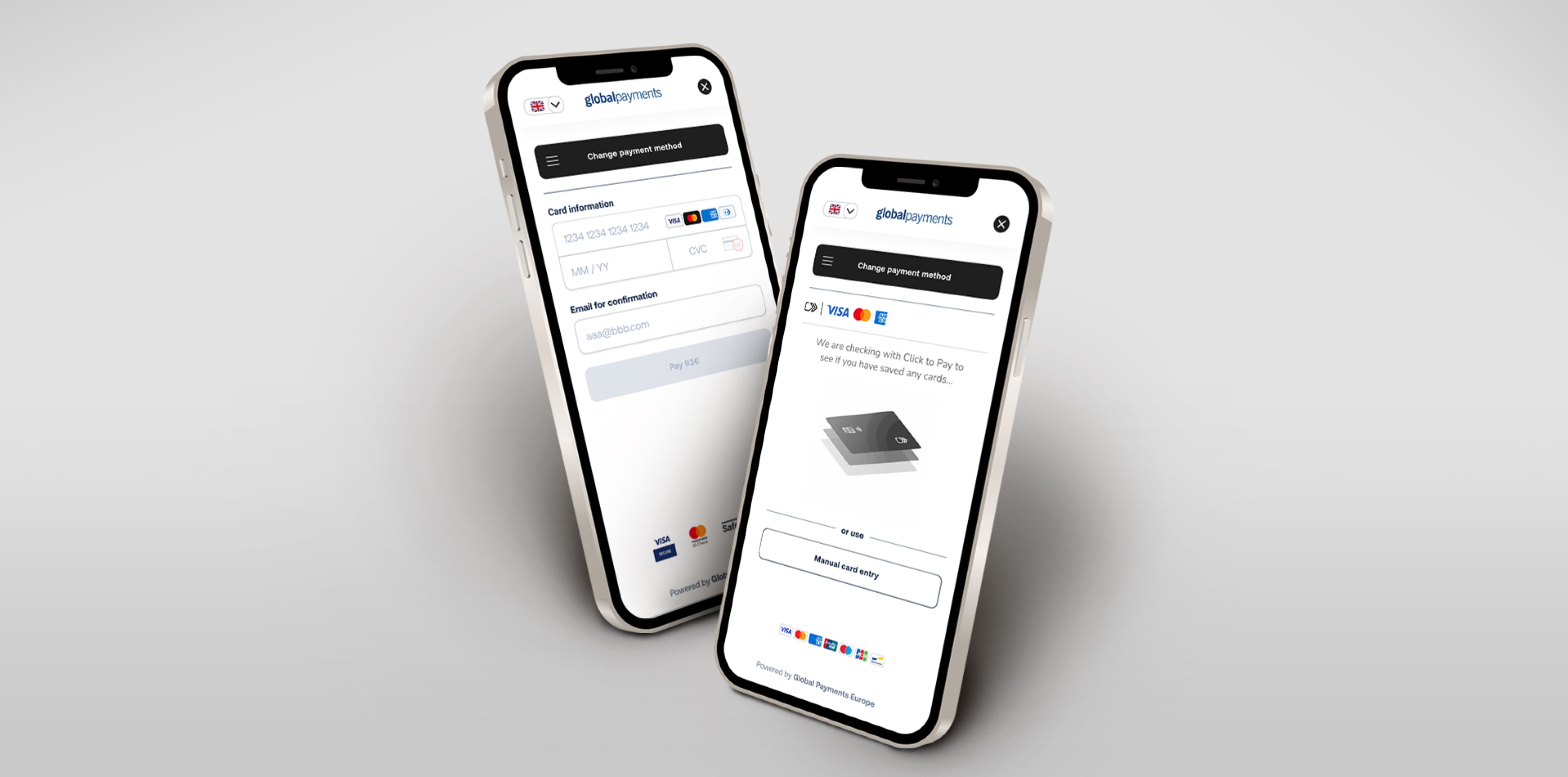
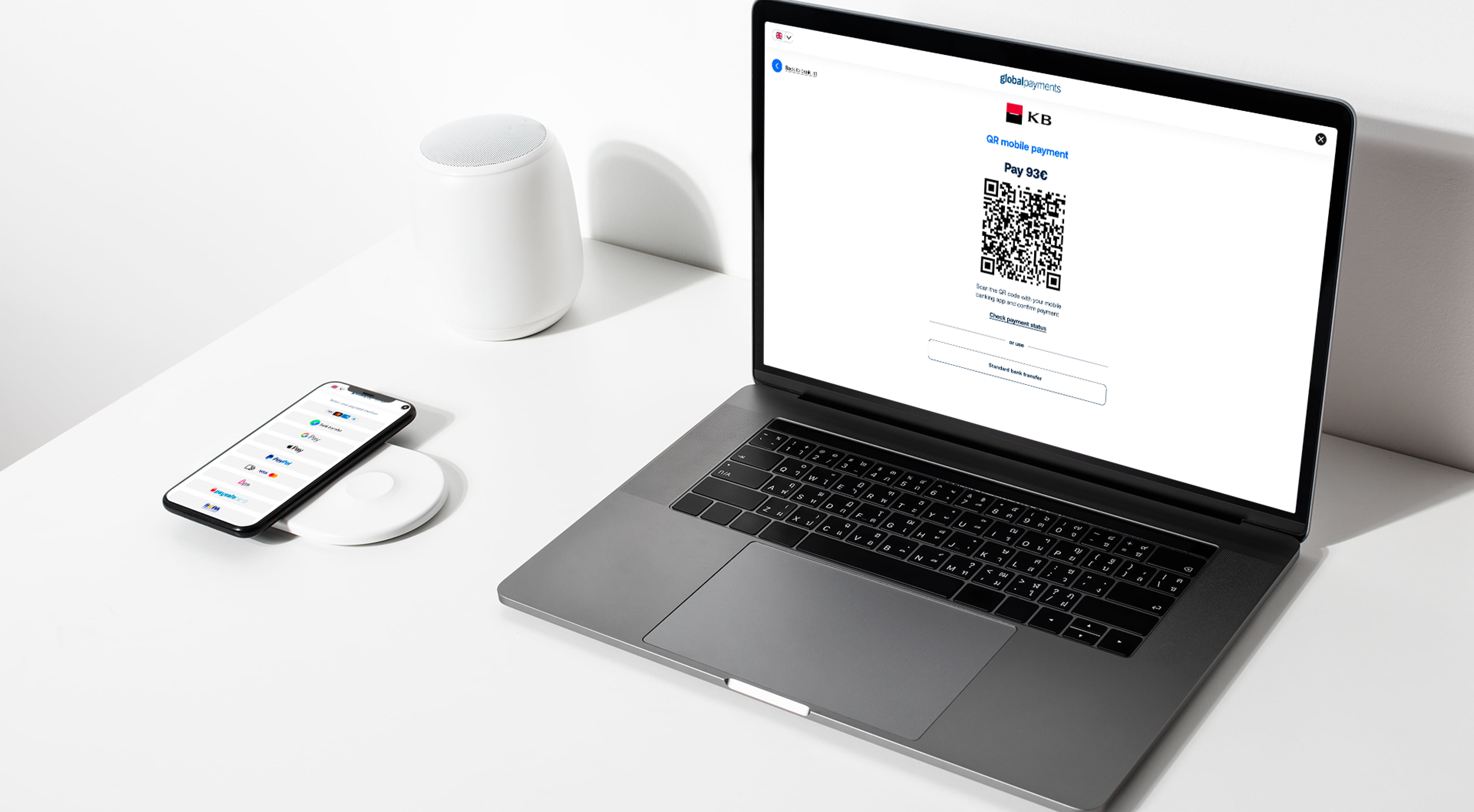
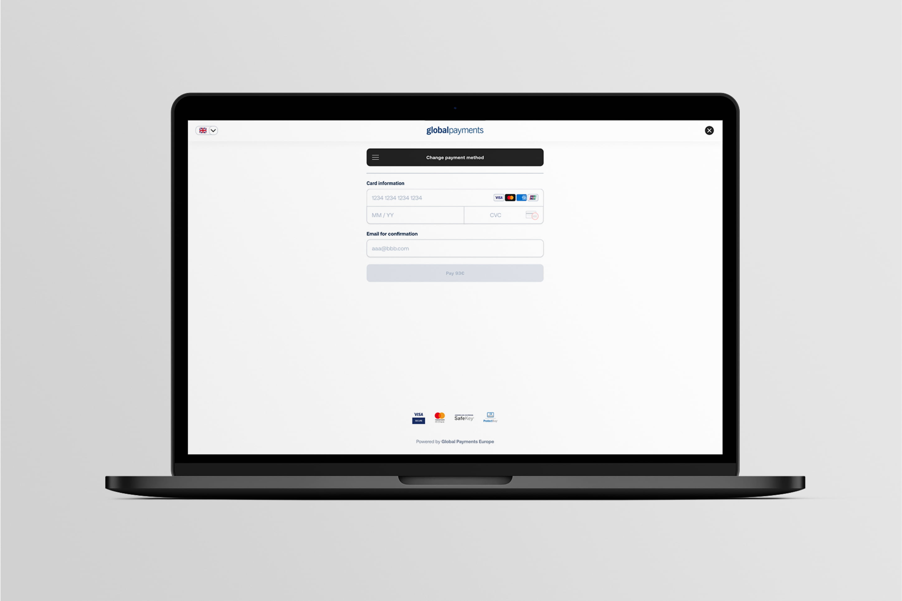
For one of the most popular payment gateways in the region we have improved and simplified online payment experience allowing users to pay faster and safer.
Challenge
GP webpay belongs to the one of most popular online payment gateways in the Czech Republic, Slovakia, Romania, Austria and it’s being used by merchants of different sizes. Unfortunately the payment experience for users and merchants was not ideal, therefore GP got many complaints about the payment process. We also wanted to move the payment experience to the next level which was relevant for 2023.
Key Insight
When everything works, you don’t notice payment gateway at all while purchasing online, but when something goes wrong it hits both merchants and the gateway provider.

Approach
We partnered with the Global payments team and Visa Consulting to leverage their industry knowledge and our understanding of users and their needs while purchasing goods online.
Using payment UX best practices we revised and designed 10+ payment flows in order to simplify them, minimise time needed to complete payment and provide clear feedback to the user in cases when something goes wrong. We used best practices in user experience design for payment systems. We reviewed and designed more than 10 payment flows to simplify them, minimize the time it takes to complete a payment and provide users with clear feedback when issues arise.
New designs were then carefully tested with end customers from different countries and merchants and their feedback was incorporated into the final designs.
Solution
The key challenge here was to optimise the user experience during the payment process and in order to make it more simple and up to date, but not to come up with a revolution that will force users to learn new processes. We also had to keep in mind that the payment gateway serves customers from 27 countries.
So our design team took every payment method (from standard Card payment to some country specific payments like Sofort) and redesigned them in order to make them work smoothly on mobile devices, where 60%+ of all payments are happening and require only necessary information to complete payment.
Our copywriters looked at all buttons and messages to make sure that they are clear to the users and provide helpful information in the case of need. Then we localised (not just translated) all messages to 27 languages to make sure that they are aligned with local payment standards. Our copywriters checked all the buttons and messages to make sure they are clear and provide useful information for users. Then we localised all messages into 27 languages to match local payment standards.
Impact
The redesigned payment gateway has been launched on four markets and has received very positive feedback from both end users and merchants. Users like new simplified and modern design, they report less problems during the payment process which leads to higher conversion rates.
In the recent time, GPE was receiving feedback from acquirers and merchants that the design of payment gateway GP webpay is perceived as outdated. Therefore, we partnered with Visa and B&T Lab to update the design of the payment gateway and improve acquirer’s and merchant’s satisfaction, and at the same time, to try to decrease the number of transactions without further processing.
I believe that the journey towards optimal up to date UI/UX design of GPE payment gateway was successful, we received only the positive feedback both from acquirers and merchants.

